31 octubre 2012

Nueva Adquisición: Impresora HP Officejet Pro 8600

Recomendamos:


Si eres arquitecto autónomo, independiente o estudiante bien sabes que sin una buena impresora para mostrar tus proyectos y venderlos a vuestros clientes mal encaminados vamos. Es por ello que hoy en Arquitectitis os queremos recomendar nuestra nueva adquisición para la oficina y que estamos encantados de la vida:


Este dispositivo nos ha llegado cual caído del cielo ya que justo se nos había estropeado una impresora (no mencionaremos la marca para no herir sensibilidades) y estábamos urgentes de un nuevo artefacto que nos facilite nuestro trabajo como arquitectos


1) Una cosa que dice mucho de la marca se ve desde el primer paso que la adquieres, en como viene en vuelta y sus indicaciones de instalación, la cual cumplió con matrícula desde que entro por la puerta. 

Nosotros además somos de esa generación que está acostumbrada a los libros de instrucciones para instalar los aparatos electrodomésticos, sin embargo nos llamó la atención que las instrucciones de instalación la impresora HP Officejet Pro 8600 vengan indicados en la pantalla LCD de color con el que cuenta el dispositivo de manera súper didáctica y con videos.  Somos completamente honestos cuando os decimos que nos fascino este procedimiento ya que nunca se nos había hecho tan fácil y rápido instalar algo. En este punto os damos a HP un 10 de calificación y os recomendamos que le suban el sueldo a quien se le ocurrió tan buena idea. Es fantástico.

2)Si bien la impresora es a inyección a tinta la calidad de la impresión es de una calidad superior, los cartuchos son cambiables según el color y además reducen el costo de impresión por página y por energía en un 50% respecto a la laser. ¡Economía ante todo!


3) Destacamos también la rapidez con la que imprime los documentos. Es todo un instrumento que entiende que el costo del tiempo del empresario de mediana empresa más valioso que las acciones del oro en este momento. 

4) Una característica que amamos es que la impresora no necesita cables ya que trabaja con tecnología wifi. De esta manera lo puedes colocar en cualquier lugar de la oficina y donde tengas un punto de electricidad.  Esto además nos permite imprimir desde cualquier dispositivo donde estemos, llegar a la oficina y tener el trabajo listo. Este ahorro de tiempo se debe gracias a que el dispositivo cuenta con una dirección de correo electrónico que al dirigirla desde nuestra cuenta de correo lo detecta como si estuviésemos en nuestra misma oficina.


.    5) Una cosa que aún no hemos probado es la opción de fax digital, alternativa que permite enviar y recibir documentos de manera electrónica y si desean de manera electrónica sin necesidad de imprimir. Sin embargo prometemos que en cuanto lo probemos os contamos seguro.

      Ahora nos vamos a seguir trabajando con nuestra mueva impresora y os prometemos que les contaremos como se va portando y en su día a día.  Que tengáis un feliz Halloween y feliz puente para descansar ^^  


28 octubre 2012

Visitando un clásico: Biblioteca de Estocolmo de Gunnar Asplund/ Visiting a classic: Stockholm City Library by Gunnar Asplund

Por: Milagros Olazábal M.
(To read English version go to the bottom of the article)

Se puede escribir lo que no está pensado de la Biblioteca de Estocolmo de Gunnar Asplund, sin embargo hoy os queremos mostrar esos detalles que muchos no mencionan y que solo te lo puede contar la experiencia de poder visitar  a uno de los mejores edificios del modernismo nórdico de principios del siglo XX.

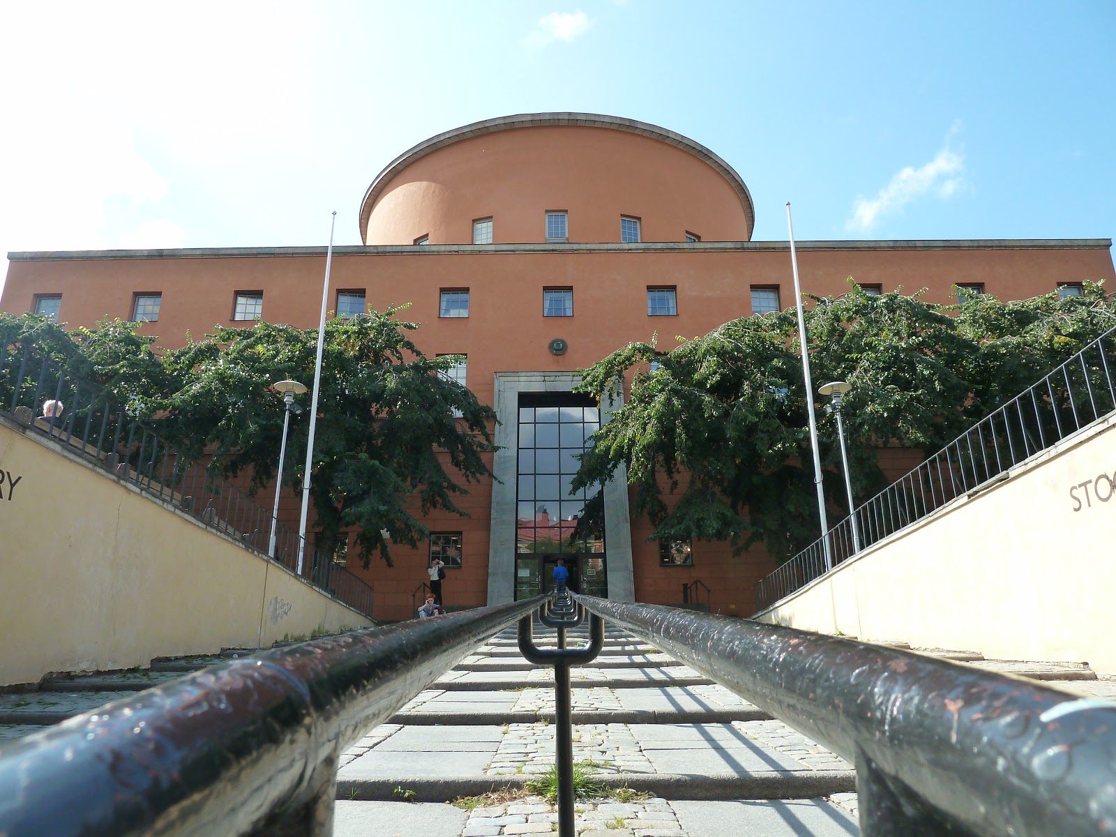
Situada entre las calles Odengatan y Sveavägen, la biblioteca se encuentra  desplazada  del vértice del encuentro de vías y al margen inferior de la colina que alberga un observatorio. Curioso es darse cuenta de las intenciones del arquitecto de entrada, ya que cabe recalcar que el lugar exacto de construcción se hizo con la intención que el edificio gane la mayor presencia dentro de la ciudad. Debido a la pendiente de la calle Odengatan, Asplund decidió dotar a la construcción de un basamento  para obtener  una plaza a nivel de fachada. Por debajo de  la plaza se aprovecha el desnivel para aprovechar estos espacios y desarrollar una zona de comercial.

Su color naranja y su compacidad como volumen es otro punto que debemos destacar ya que lo hace muy llamativo en medio de esta ciudad nórdica que la mayor parte del tiempo no cuenta con horas de sol efectivas por encontrarse a latitud 59º norte.


El acceso principal se encuentra en la calle Sveavägen y se hace mediante una escalera con contrapasos muy bajos, así como con unos descansos amplios y cómodos. Una vez dentro llama la atención el color negro con el que está revestido todo el lobby, así como sus relieves horizontales de personajes griegos, los cuales son texturas que rompen la verticalidad de este pequeño espacio de bienvenida. Todos estos pequeños detalles ayudan a dirigir la mirada hacía el acceso principal que dirige hacia el espacio principal de la biblioteca.


Es en este espacio donde se encuentran la mayoría de los libros del centro, están dispuestos en tres plantas y alrededor de este volumen, son los principales protagonistas. Nuestra  memoria nos hace evocar a la Biblioteca de Louis Boullée o a la Villette de Claude Ledoux y nuestra memoria no nos falla ya que son estos arquitectos ilustrados los que fueron referentes de Asplund cuando hizo sus investigaciones para desarrollar el proyecto.

El espacio roba el aliento por lo espectacular de su ejecución. El contraste de texturas que dan los tres niveles de libros con sus respectivas pasarelas con la pared blanca de la parte superior del cilindro, invita a los lectores a querer recorrer sus pasarelas y sentarse a disfrutar de una tranquila lectura. La luz que proviene de sus ventanas superiores, en conjunto con la lámpara de vidrio traslucido que cae en medio del espacio,  hace que este cuerpo se encuentre perfectamente iluminado.  

Llama la atención además, que a diferencia de Boullée, las escaleras de acceso a las pasarelas superiores no se encuentres a plena vista (salvo la que lleva al 1º nivel) ya que se ubican detrás de las puertas de escape. De esta forma Asplund logra un espacio donde los libros son los elementos que predominan en todo su esplendor y no sus accesos.


Otro contraste que despunta son las bajas alturas de paso entre el espacio cilíndrico con las salas anexas. Esta diferencia sensorial hace destacar mucho más las diferencias de alturas entre los 5 niveles del ambiente principal con la doble altura con las que solo cuentan los espacios auxiliares. Altamente destacable.

No podemos acabar esta nota sin contaros los grandiosos que son los detalles de estilo neoclásico que el arquitecto Sueco desarrollo para este proyecto como  los marcos de las entadas, los frisos del volumen exterior, los muebles de la sala de lectura de niños, la lámpara del espacio principal y los materiales escogidos. 


All the images are copyright. Please mention this website if you are going to use it. 

Sin más os invitamos a visitar esta obra nórdica en caso tenéis la oportunidad de ir por cualquier motivo a Estocolmo y si ya habéis estado por ahí, que nos comenten vuestras experiencias para poder enriquecernos todos de estas lecciones prácticas que nos da el buen viajar.

¡Hasta la próxima amigos de Arquitectitis!  


(English version)


We can say a lot of things about the Stockholm City Library; however, today we will show you a new point of view based on our own experience after having visited this amazing place. We must emphasize the fact that this building is one of the best examples of the modern Architecture of the 20th century.

Designed by the Swedish architect Gunnar Asplund in 1924, it is located between Odengatan and Sveavägen streets and the building is built on a platform to create a public area at entrance level. Because of the big slope on Odengatan Street, the space under the plaza allows for commercial use and it is very alive nowadays. The place where the library is built is located at the corner of the bottom of a hill, and it was carefully chosen by the architect. 

The Library is an orange compact prism with a big cylinder in the middle of the volume. The color is remarkable and makes sense if we think that the project receives little natural light during most of the year due to its location on 59º N latitude.

The main entrance is on Sveavägen Street  after  a confortable staircase that brings elegance and importance to the building. After going through the main door we enter a tall, black lobby with Greek  bas-reliefs where  visitors can either go directly into the main library space or to a cafeteria and a children’s reading area. 
The protagonist of the project is without a doubt the main space located inside the cylinder. In order to access this space, we must travel through a dramatic set of stairs which is connected with the lobby. This main space is surrounded by three levels of bookshelves and it is well lit because it receives natural light from the top windows and a magnificent lamp. 

This kind of intervention reminds us of the Library by Louis Boullée or the Villette of Claude Ledoux. This is logical because both enlightened architects were references researched by Asplund when he designed this project. 

Back to the main space, we must say it is breathtaking due to its impeccable execution. The contrast between the bookshelves and the white wall at the top of the cylinder is fantastic and readers feel invited to walk around the different levels, take a book and enjoy reading. In the middle of the space, the way the architect hides the stairs to access each level of bookshelves calls our attention.  The reason is simple; Asplund decided to put the stairs behind the cylinder wall to maintain the bookshelves aligned to it. Boullée’s library for example relied on setting each level back in order to accommodate access to each level. That way the volume preserves the same space without visual interruptions.    

Another contrast we find superb is the space used to separate the cylinder from the secondary spaces that surround it. You can clearly feel the difference going from a main space with a height of 5 stories to one with a two-story height used for reading spaces. This is a further example of the compression and dilation of spaces that we find throughout this building, starting with the main lobby described earlier. 

Finally, we must mention the high-quality details that the Swedish architect designed for this building such as the framing of the doors, the wooden treatment of the bookshelves, the furniture in the children’s reading room, the lamps and the general materials chosen.   

Hopefully you will have found this article interesting and you will have learnt something different about this building. If you have already had the opportunity to visit this place we would appreciate it if you sent us your comments regarding what was you liked about this building the most.

Until next time! 

22 octubre 2012

EXHIBITION: Zaha Hadid. Beyond Boundaries, Art and Design

Nota de Prensa: 
(To read English version go to the bottom of the article)


Zaha Hadid. Beyond Boundaries, Art and Design. 04/09/12 - 03/11/12 from Ivorypress on Vimeo.

Si estas en Madrid o vas a pasar por aqui te recomendamos la muestra que Ivorypress acoge, hasta el próximo 3 de noviembre, la muestra Zaha Hadid. Beyond Boundaries, Art and Design. La exposición plantea un recorrido por la producción artística de la arquitecta Zaha Hadid (Bagdad, Irak, 1950), en la que se refleja su personal visión del mundo. ¡No te lo pierdas!

(English version) 
If you are in Madrid or you are going to come in the next few days Ivorypress presented the exhibition Zaha Hadid. Beyond Boundaries, Art and Design as part of the annual architecture programme celebrated each autumn. The exhibition, which opened on 4 September 2012 until on 3 of november, sets out a wide view of the artistic body of work of the architect Zaha Hadid (Baghdad, Iraq, 1950), which reflects her personal and unorthodox world-view. Don´t miss it! 

19 octubre 2012

Arquitectura, ¿hasta dónde?

Por: Javier Sancho
(To read English version go to the bottom of the article)


Querría ser hoy crítico y, sobre todo, desencadenante de debate, con nosotros, lo que podemos hacer y lo que se nos ofrece. ¿Cómo funciona esto?

Para ello propongo un texto, el cual se puede analizar y dar vueltas, borrar partes, intentar desentrañar significados ocultos. He intentado cotejar respuestas durante estos dos años de vida del mismo (véase la fecha, datada la Nochebuena de 2010): la única que no me ha salido, vean Ustedes, es la que tenía que escribirle de vuelta a dicho estudio (sin mentar el nombre, no sé si correcta mi postura, mas siendo de un servidor el presente me pondría “colorado”)… Cuánto arrepentimiento me oprime, porque seguramente no pueda disfrutar de una enseñanza tan intensa, tan rica en valores, tan alimentada por el aire (porque otra cosa, con las condiciones del mismo, no creo que pudiese llevarme a la boca, a no ser que los humanos empezásemos a digerir cartón pluma y pegamento)

No iré más lejos, ser más explícito sería doloroso.

Podríamos generar un genial mural de estampitas, un collage de atrevimientos, un proyecto de palabras perdidas.

Con la presente me despido hasta la próxima, por supuesto y como siempre, sobre arquitectura (y VIDA).

Hasta luego,

Ba’C

Javi


English Version:

So I´d like to be critic and, what´s more, to generate a speech, over ourselves, what we can do and what’s offer to us. How does it work?


For that here´s a text, which you can analyze and rotate, erase parts, try to get hidden meanings. I´ve compare answers which I gave to myself through these two years (look the date, Holy Night 2010): the only one I never did, if you agree, is the one I had to give to this office (without name, I don´t know if it´s right, but being my e-mail I would be ashamed)… How regret am I, cause surely I couldn’t enjoyed an intense experience, rich in values, feed with air (cause other thing, with the terms you observ, I don´t think I could eat, despite the fact human beings start to digest foam and glue)

I won´t go further, to be more explicit would be painful.

We could create an awesome post-wall, a daring-collage, a lost-words project.

With this, see you till next one, of course and as usually, about architecture (and LIFE)


17 octubre 2012

Libro: Porqué importa la ARQUITECTURA. De:Paul Goldberger


Nota de Prensa:
(To read English version go to the bottom of the article) 
El 15 de octubre, Ivorypress Publishing House presentó el libro Por qué importa la arquitectura, de Paul Goldberger, el segundo volumen de la colección Ivorypress Essential. El acto contará con la presencia del autor; del arquitecto y catedrático de Proyectos en la ETSAM, Luis Fernández-Galiano, autor del prólogo del libro; y de Elena Ochoa Foster, fundadora y directora general de Ivorypress.

Esta edición es la versión al castellano de Why Architecture Matters, un texto publicado en 2009 por Yale University Press en el que Goldberger pone de manifiesto cómo y por qué la arquitectura nos afecta tanto emocional como intelectualmente. La traducción de Jorge Sainz, en diálogo con el autor, ha enriquecido y matizado el sesgo más localista del texto original, dotándolo de un tono y un enfoque más universales.

Fiel a su prosa clara y concisa, Goldberger elabora un tratado en el que explica cómo la arquitectura no solo nos proporciona refugio, sino que configura de modo singular nuestra relación con el espacio y el tiempo. La arquitectura contribuye a construir lugares significativos que son portadores de nuestra memoria colectiva y que tienen, por todo ello, un profundo valor simbólico, cívico y ético. El volumen no es un trabajo de historia de la arquitectura, ni una guía de estilos arquitectónicos, ni un diccionario de arquitectura, si bien posee elementos de los tres.

El estilo de Goldberger, de convicciones tan eclécticas como firmes –tal y como señala Luis Fernández- Galiano en su prólogo– logra salvar la brecha entre las arquitecturas patrimoniales que son del gusto de casi todo el mundo y las de vanguardia, más difíciles de aceptar. “La seducción de la prosa de Goldberger ha de hallarse en su enraizamiento urbano y en su ausencia de dogmatismo, que le permite entrar en resonancia con el pulso de la ciudad”, explica Luis Fernández-Galiano. De este modo, Goldberger acerca al público profano los secretos de una disciplina que habita siempre en el umbral de la estética y la funcionalidad.

Paul Goldberger (Nueva Jersey, EE. UU., 1950) ha sido calificado por The Huffington Post como “la figura principal de la crítica arquitectónica”. Comenzó su carrera en The New York Times, donde en 1984 obtuvo el Premio Pulitzer en la categoría de crítica, la más alta distinción del periodismo estadounidense. Desde 1997 hasta 2011 fue el crítico de arquitectura de The New Yorker, donde escribía su conocida columna “The Sky Line”. Actualmente es colaborador de Vanity Fair. Ocupa la cátedra Joseph Urban de Arquitectura y Diseño de The New School (Nueva York), universidad de cuya escuela de diseño y arquitectura, la Parsons, ha sido también decano.

Por qué importa la arquitectura es el segundo título de la colección Ivorypress Essential, en la que Ivorypress edita obras esenciales de reflexión en torno a disciplinas relacionadas con el arte contemporáneo. El primer volumen de esta colección fue Un oficio de locos. Editores fundamentales en conversación con Juan Cruz Ruiz, un libro que aborda el presente y el futuro de la industria editorial por medio de una selección de entrevistas a los editores mas emblemáticos de los siglos XX y XXI.


(English version)
The last 15 October, Ivorypress presented the book Por qué importa la arquitectura by Paul Goldberger, which will be the second book of the Ivorypress Essential collection. The event will be attended by the author along with architect Luis Fernández-Galiano—professor of architectural projects at ETSAM and author of the book’s preface—and Elena Ochoa Foster, founder and CEO of Ivorypress.

This book is the Spanish edition of Why Architecture Matters, a text published by Yale University Press in 2009 in which Goldberger elucidates why and how architecture affects us, both emotionally and intellectually. Jorge Sainz’s translation, in conversation with the author, has enriched the text accordingly and expanded its original, more local focus, making it more universal in tone and scope. Faithful to his clear and concise prose, Goldberger has elaborated a treatise in which he explains how architecture not only provides us with shelter but also shapes our relationship to space and time in a singular way. Architecture contributes to the construction of significant spaces that bear our collective memory and which therefore hold a profound symbolic, civic and ethical value. This volume is not a work on the history of architecture, an architectural styles guide, nor a dictionary of architecture, although it contains elements of all three.

Goldberger’s style, imbued with convictions that are as eclectic as they are firm—as Luis Fernández- Galiano points out in his text—succeeds at bridging the gap between patrimonial architecture, which almost anybody can enjoy, and avant-garde architecture, which is often harder to accept. ‘The seduction of Goldberger’s prose must be found in its urban rooting and in its absence of dogmatism, which allows him to resonate with the pulse of the city’, explains Luis Fernández-Galiano. In this way, Goldberger draws the lay public closer to the secrets of a discipline forever living in the threshold between aesthetics and function.

Paul Goldberger (New Jersey, US, 1950), has been described by The Huffington Post as ‘the leading figure in architecture criticism.’ He began his career in The New York Times, where he obtained the Pulitzer Prize for distinguished criticism in 1984, the highest award in American journalism. From 1997 to 2011 he was the architecture critic of The New Yorker, where he wrote his well-known column ‘The Sky Line’. He is currently contributing editor of Vanity Fair. He is Joseph Urban Professor of Design and Architecture at The New School in New York and has also been the dean of Parsons The New School for Design.

Por qué importa la architectura is the second title of the Ivorypress Essential collection under which Ivorypress publishes essential works that provide new insight regarding disciplines related to contemporary art. The first volume of the collection was A Crazy Job. Leading Publishers in Conversation with Juan Cruz Ruiz, a book that approaches the present and future of the publishing industry by way of a selection of interviews to the most distinguished publishers of the 20th and 21st centuries.


11 octubre 2012

WTC São Paulo

Por: Omar Cornejo Felice
(To read English version go to the bottom of the article)


¡Hola Amigos de Arquitectitis!, en esta segunda entrega quiero traer a ustedes mi experiencia en el WTC de São Paulo en Brasil, como su mismo nombre señala es un complejo empresarial y de negocios internacional  que alberga al Sheraton São Paulo WTC Hotel así como al WTC Tower, que es una torre de oficinas con 25 pisos y 158 mts de altitud, donde compañías como Microsoft, Hewlett-Packard, Monsanto, Towers Watson y Global Village Telecom, Sansung, Duke Energy International  tienen oficinas, WTC Convention Center, Business Club, El Centro de Decoración y Diseño, y el Centro Comercial D&D  así como bancos y restaurantes 5 tenedores.


Este complejo esta muy bien integrado tanto a nivel de superficie como a nivel del subsuelo,  ubicado en una zona privilegiada de São Paulo, entre la marginal de Rio Pinheiros y la av. Engenheiro Luís Carlos Berrini en el distrito de Santo Amaro en la zona sur de la capital paulista.


A la llegada del complejo uno es recibido a mi opinión por uno de los puentes más impresionantes de América Latina que es el puente Octávio Frias de Oliveira que cruza el Rio Pinheiros y tiene dos pistas independientes de 60°, este puente tiene unos 168 mts de largura y 138 mts de altura y tiene una estructura central doble hecha de concreto armado y sustenta la estructura de los carriles de automóviles por cables de acero.


A la llega al  WTC de São Paulo sorprende por su tamaño y es considerado el más grande de América Latina desde su fundación en el año 1995 ya que cuenta con 277,000 m2 de área construida.


Una de los espacios que más me impresiono fue el WTC Convention Center que es un espacio multiusos de 5 pisos y con casi 12,000 m2 divididos en 60 espacios, solo el llamado Golden Hall cuenta con 3,000 m2 donde tuve la oportunidad de disfrutar su acústica ya que su forma de cúpula ayuda a que el sonido fluya sin mayor problemas.


Espero que les haya agradado esta pequeña nota, espero sus comentarios y  ¡Hasta la próxima!

Y...no os olvidéis de votarnos en Bitacoras2012 ;)


English Version


Hello friends of Arquitetitis!, In this second installment I bring you my experience in the WTC São Paulo in Brazil, as its name indicates is an international business complex, the Sheraton Sao Paulo WTC Hotel and to WTC Tower is an office tower with 25 floors and 158 meters high, where companies such as Microsoft, Hewlett-Packard, Monsanto, Towers Watson and Global Village Telecom, Samsung, Duke Energy International have offices, WTC Convention Center, Business Club , The Decoration and Design Center, and the Mall D & D as well as banks and 5 forks restaurants.


This complex is well integrated both surface and subsurface level, located in a privileged area of ​​São Paulo, between the Rio Pinheiros marginal and av. Engenheiro Luis Carlos Berrini in Santo Amaro district in the south of the state capital.

On arrival one is greeted complex in my opinion is one of the most impressive bridges in Latin America that is the Octavio Frias de Oliveira crossing the Rio Pinheiros and has two separate tracks of 60 °, this bridge is about 168 meters length and 138 meters high and has a dual core structure made of reinforced concrete and sustains the structure of car lanes by steel cables.

To reach the WTC São Paulo surprising for its size and is considered the largest in Latin America since its founding in 1995 as it has 277.000 m2 of built area.

One of the areas that impressed me most was the WTC Convention Center is a multipurpose space of five floors and almost 12,000 m2 divided into 60 spaces, only the so-called Golden Hall has 3,000 m2 where I had the opportunity to enjoy its acoustics as its domed sound helps the greater flow without problems.

I hope you liked this little note and I welcome for your comments and until next time!


LinkWithin

Related Posts with Thumbnails